The Style Files
My thoughts on design, writing and entrepreneurship.
Photo credit (background): www.pexels.com
Photo credit (background): www.pexels.com
 Translators make remarkably ineffective bloggers. Photo source: www.pexels.com As a former translator, I'm awfully opinionated about my previous industry. Many translators are excellent writers; they're just woefully inadequate at every other aspect of effective content creation. Here's why. I'd first like to clarify that I do not mean to suggest that every single translation blog falls short of the mark. (Let's be real, though: the good ones are few and far between.) Most are written by linguists who post for cathartic reasons rather than income so their writing objectives are entirely different from the jump. No matter the reason, here's what I found time and time again: 1. Wall of words Many translation blogs look like novels in a digital format. There are pages upon pages of long paragraphs and a few headings or subheadings sprinkled throughout. Unlike a normal blog which is deliberately designed to be balanced by white space and other visual interest like photos, videos or varied text, translation blogs are dense walls of solid words and heavy reading.  2. Diary format Translators have a tendency to live in their own little bubbles and these blogs are a representative microcosm. Many blogs seem to be written about events that happened that day not unlike a diary. In the same way, diaries are usually written for an audience of one; I would argue that most translation blogs have the same limited appeal. Isn't knowing your audience rule no. 1 for writers?  3. Excessively long posts Much like no. 1 on this list, the wall of words that constitutes a translation blog is often impossibly long. Reading an actual book isn't a chore with the separation of pages but scrolling a translator's blog can feel like an eternity. It's not that some of the posts aren't relevant; they're just inexpedient. 4. Lack of structure The theme so far seems to be writing in excess. It's hard to teach an old dog new tricks and obviously, translators are used to writing in volume. Structure is regrettably all but absent in the translation blogosphere. Aside from a few headings here and there, the writing itself tends to wander aimlessly without any semblance of organization or an outline. 5. Inner monologue encyclopedia This one strikes me as odd considering translators have to account for consistency and organization within a text on a daily basis. Many translation blogs have a giant list of every blog ever written in chronological order but no other groupings by topic or blog type. That's likely because the only category is miscellaneous musings ad nauseum but it's no excuse!  A year in the life of a translator's thoughts. Photo credit: www.pexels.com 6. Poor website design I get it: the platforms are free and translators are writing pros, not graphic designers. The problem is posting a chunk of text on a website meant for blogging doesn't make it real. Where is the menu? What about a link to your actual business? I've seen my fair share of translation blogs that feature nothing but itsy-bitsy words on a depressing grey background. If I came for the content, I'll still leave for the layout. 7. Mysterious author Do you know how many translation blogs seem to be written by an invisible hand? A bio should be easy to find on any website regardless of how much you'd prefer to hide behind a screen. (Believe me, there are a million things I'd rather do than have my face plastered across a website but it's par for the course.) Keep it short and sweet if you want but throw us a bone, please!  8. 1980s headshots While I'm on the subject, 1980s headshots need to be a thing of the past. I grew up in the 90s and wouldn't dream of showing my high school headshots to anyone. It's possible this is mainly a problem in my language pair since German speakers ages 40 and over have a real affinity for outdated pics. Please, take a selfie and get it over with.  9. Preaching to the choir The thing about translation blogs is they mainly pertain only to fellow translators. We're likely all too familiar with the latest gripes you have or problems facing our industry since our jobs are nearly identical. If translators could figure out a way to make their content marketable to other audiences (and get with the program in terms of blogging in general), they could be a real asset to the writing world. 10. New/old divide Technology has rocked the boat across many sectors but it's wreaked real havoc in the translation industry. There's a huge divide between the new and old generation because technology has completely transformed the way we work, for better or worse. For the most part, it's usually younger linguists making YouTube videos and joining social media groups for translation content. The blogs I've seen often represent the older generation of translators who are less receptive to tech changes and know their craft like the art form it is. The problem is we need to bridge the gap!  We need older and younger translators equally. Photo credit: www.pexels.com What's the lesson to be learned from all of this? For one thing, older and younger translators need to come together. Being a linguist is hard enough with increasing pressures facing our industry so it's time to learn from each other. I'd also suggest increased levels of visual literacy and marketability on the blogging front and sharper content.
Those are my two cents, anyway, and you're welcome to give your take down below. Take care, thanks so much for sharing your valuable time and I hope to see you again soon!
0 Comments
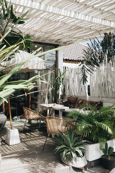 Home goals! Photo credit: unsplash.com As someone with a background in design, I can tell you it definitely comes in handy when envisioning your space. Think of it as a cheat sheet to design like a pro! I'm a big proponent of getting back to basics and making projects approachable. 1. Stick with a theme The way to start any design is to identify the theme you want for a space. Consider major themes like farmhouse, modern, bohemian, corporate, etc. It could be anything: a season, city, favorite activity or visual element that ties in with the rest of your house or neighborhood. Be bold and consistent with this one. 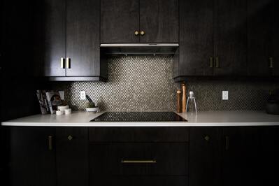 The theme here is dark, metallic and masculine. Photo credit: unsplash.com 2. Choose your colors Choose a main color, a secondary color and possibly a third color for small touches. Please do this BEFORE you start anything else. (We all know what it's like to let your creativity run wild and end up with every color in the crayon box!) Pro tip: color generators like www.canva.com can help you if you're feeling like a fish out of water. Just remember that colors look way more intense on a wall than a tiny swatch.  Choose wisely! Color can make or break a designed space. Photo credit: www.pexels.com 3. Think big, then little When buying furniture or planning a room, think of the major items first. For example, buy a couch and match other furniture accordingly. Focusing on the big things also helps make the process more manageable. 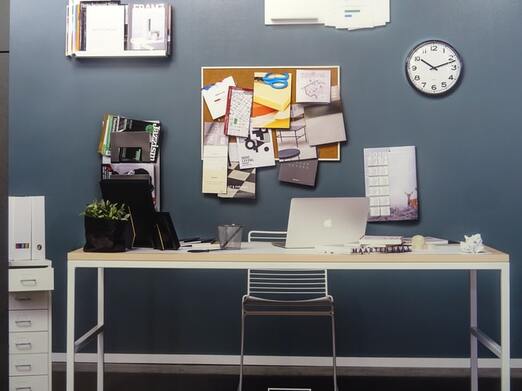 Start with the desk and move on to smaller items. Photo credit: www.unsplash.com 4. Play with pattern, color and texture It's all about adding touches of visual interest. You can do that by incorporating patterns or prints, different colors and textures in your design. Some spaces choose to go heavy on one visual medium (see the texture-rich patio at the top of this article, for example) while others like the kitchen below rely on patterns. 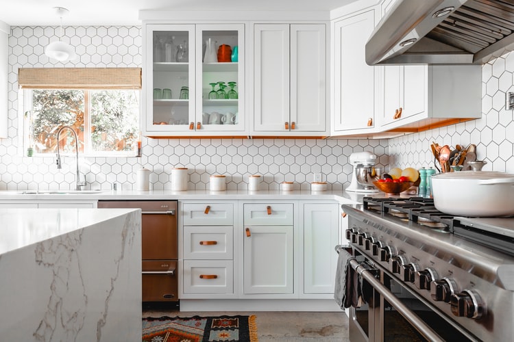 This kitchen uses multiple patterns (marble, honeycomb) to add visual interest. Photo credit: www.unsplash.com 5. Positive and negative space Ivy Roberts explains "[p]ositive space refers to the main focus of a picture, while negative space refers to the background" (study.com/academy/lesson/positive-negative-space-in-art-definition-examples.html.). Using positive and negative space is like inhaling and exhaling. You need a balance so your design isn't too crowded or too empty in a 2D or 3D sense. 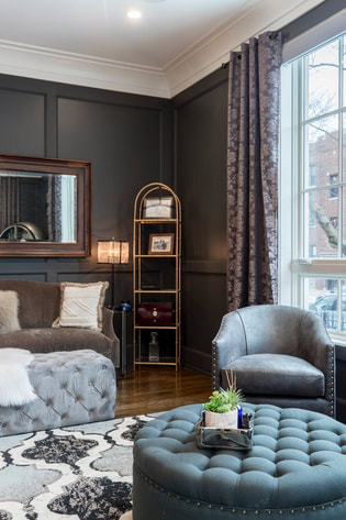 Not too little and not too much! Photo credit: www.pexels.com 6. Size matters In the design world, size as a ratio is referred to as scale. The size or scale of everything should make sense in your space. For example, it's best to put a large picture or decoration on a large wall and a small desk in a tiny office. That may sound simple but it's important to remember for a balanced look. 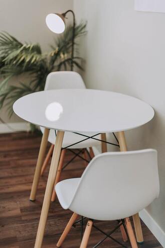 The table, chairs, lamp and plant are all the right size for a small space. Photo credit: www.unsplash.com 7. Use and beauty Never forget that your space should be useful! Beauty is key but good architecture and interior design is a marriage of form and function. Often, that means you should consider the purpose of a room before designing it. A mud room, for example, should be practical so delicate furniture wouldn't suit the space. 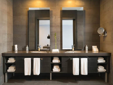 A bathroom should always balance use and beauty. Photo credit: www.pexels.com 8. Don't be afraid The biggest mistake homeowners make is being afraid to try something new. Make a statement and be proud of your design choices! Approach design like a child in that you should choose something that makes you happy. If we all made safe decisions about something as expressive and personal as design, you'd end up with a waiting room vibe. Interior design is meant to reflect the people who use it.  Above all, don't be afraid to use color! Photo credit: www.unsplash.com 9. Editing is everything Editing goes back to honoring your theme. Avoid looking haphazard or random at all costs! Remember that editing is a part of the design process and something that even professionals do. The important thing is to end up with a space you love so there's no harm in making adjustments to get you there. 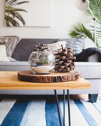 10. Remember the feeling When you're all done, good architecture or interior design should give you a feeling. Should your space feel relaxing, playful, dynamic or formal? It depends on what you're after. Also remember that design is somewhat subjective so a room that gives you all the feels might not be your neighbor's cup of tea. That's no big deal! If you like it, that's all that really matters.  Home is often a peaceful place reflected by your design choices. Photo credit: www.pexels.com Now that you know how to conceptualize design, you're on your way! Obviously there are a million ways to approach art, design, organization and living pretty and these tips are mainly meant as an introduction. Did you apply any of them to your own home? Are you interested in reading more actionable design articles like these? Let me know what you think in the comments section and I hope to see you again soon!
|
AuthorHi, my name is Martha Oschwald and I'm a content writer focused on design. This page is meant to give you a taste of my writing style and latest musings. Archives
April 2022
Categories |
 RSS Feed
