The Style Files
My thoughts on design, writing and entrepreneurship.
Photo credit (background): www.pexels.com
Photo credit (background): www.pexels.com
|
For anyone familiar with design, you likely know that good taste is subjective. The issue of style is constantly debated in the design world. On one hand, it's a good thing: everyone's invited to the table. On the other, some things are simply outlandish. Today, I'll focus on the latter within the scope of interior design. Natural Themes One of the things that confuses people most is knowing what's accepted and what's not. You might see examples of interior design ideas that work perfectly well for a certain time, context or client but not in others. For instance, I might like Baroque architecture in an Austrian castle but casing my books in pigskin would be a bit much in a city apartment. There are other times when a design theme is so broad that people aren't sure how to implement it. Adopting natural themes is one such case. For example, here's a tree decoration which was beautifully incorporated into the structural/wall design of a home: 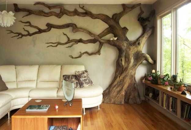 Photo credit: www.pinterest.com/pin/407364728765650182/ As you can see, the tree design was thoughtfully placed next to the furniture and without nearby obstructions; its artistry can be appreciated as stunning statement piece. The colors and materials of the rest of the room are also deliberately correlated to the tree sculpture for a cohesive, graceful design. On the other end of the spectrum, we find natural elements in a home which look entirely random and out of place. (It's worth mentioning that there are ways to design with actual natural elements converted for indoor use although this isn't the answer.) What's most shocking is this photo's prominence in a respected architectural publication, Romantic Homes. I invite you to see for yourself: 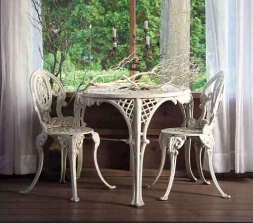 If I'm being candid, this looks like something the cat dragged in. Yes, the person in charge of this project painted a branch white to match the table and curtains. (Look closely, however: the bottom dips down out of sight so it might actually part of an overgrown floor plant.) It's still very much an unsightly dead branch mysteriously plopped on a table. Some other problems spring to mind: what about the ever-important issue of scale (i.e. size ratio)? The table might be used largely for decoration but the branch is enormous by comparison. Then there's also a candelabra competing for attention. Whether solo or coupled, this decorative scheme fails to skillfully incorporate natural elements in an elegant or even passable way. Overdoing the White Another style faux pas, in my book, is overdoing it with white. First, I should clarify that there is a way to effectively use white in interior spaces. Especially in northern regions, we're familiar with the beauty of a fresh snowfall as well as winter wonderland-inspired designs. Here's an example of interior designscape bathed in a soft, glittering white: 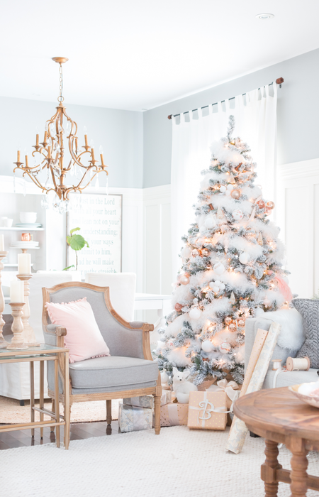 Photo credit: aibd.org/holiday-decorating-tips/ This example from the American Institute of Building Design uses white in perfect combination with soft accents colors. The gold, rose gold and pink add enough from a color palate to provide contrast while the soft greys add a touch of sophisticated base. All of the colors work together to form a gentle, winterly theme reminiscent of a sugarplum fairy. In short, this is a premium example of how best to decorate with white by letting other colors contrast its beauty. Now let's consider what not to do. First of all, defaulting overwhelmingly to white a classic rookie mistake and in line with the seas of beige in 90s decor. However, I'd be remiss to suggest it's only a thing of the past. Nope; whitewashed interior design is unfortunately all too common (and unbelievably boring). 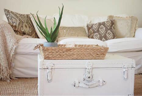 You might think the example I'm using isn't that bad. It does do some things well like incorporate elements of texture and print to provide more than a solid backdrop of nothingness. However, the point here is that snooze-worthy, overly white design IS absurd since expression and ambience are the main objectives. Yes, it's possible to have beachy vibes or low-key appeal without being a monochromatic bot so I'd suggest reaching a bit higher. Minimalism vs. Moved-In We can all agree that there is such a thing as having too many things in a space. Whether the furniture is too tightly cramped together or storage is insufficient, there's something to be said for the calmness of a minimalist design. 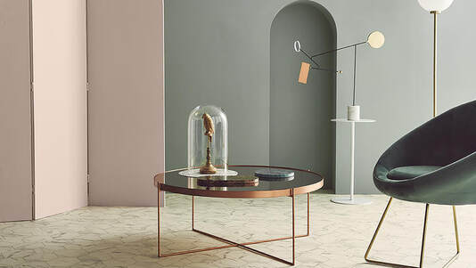 Photo credit: home.tarkett.com/en_EU/node/take-a-moment-and-breathe-while-surrounded-by-the-beauty-of-sophisticated-minimalism-8958 In the above example, you can see that the minimalist theme to interior design is upheld by open spaces, minimal furniture and very limited decorations. It's very deliberate, however, in its repeated use of visual elements like the fine metal rods in the chair, coffee table and lamp designs. The color themes are relaxed but purposeful by pairing muted mauve and sage green with copper and a subtle, marbled floor. Nothing about this design looks apathetic or haphazard. Even so, there's a lot of grey area between minimalist design and a barren room. You'll sometimes hear people claim their apartment is meant to be minimalist (i.e. a deliberate design decision) but it comes off more like moving day. Let's set the record straight on this one and illustrate what doesn't qualify as effective minimalist decor: 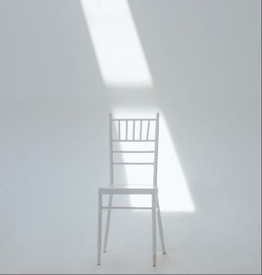 Photo credit: www.pexels.com As you can see, the image above shows a chair in an empty space. The end. Technically, matching the chair color to the wall could be considered a design choice although we covered the risks of relying too heavily on a single color palette. In the same vein, making no effort by having next to nothing in a room meant for human use can hardly be described as a conscious decision. This spin on minimalism comes off as insincere and unintentional.
Final Thoughts Beauty is in the eye of the beholder although it's fair to say there are certain tenants of good design. Bear in mind that while taste is somewhat subjective, it can be helpful to identify positive and negative interpretations of the same theme particularly before starting a project. Going through exercises like these can help you identify the things that make or break a room. What's your take on these design successes and failures? Can you think of other interior design or architecture themes you'd like to compare? Leave your comments down below and share your experiences with themes gone wrong or right.
0 Comments
Leave a Reply. |
AuthorHi, my name is Martha Oschwald and I'm a content writer focused on design. This page is meant to give you a taste of my writing style and latest musings. Archives
April 2022
Categories |
 RSS Feed
